Type
Financial Web App Design
Financial Web App Design
Timeline
4 weeks
4 weeks
Role
UX & UI Designer
UX & UI Designer
Team
Solo project
Solo project

Overview
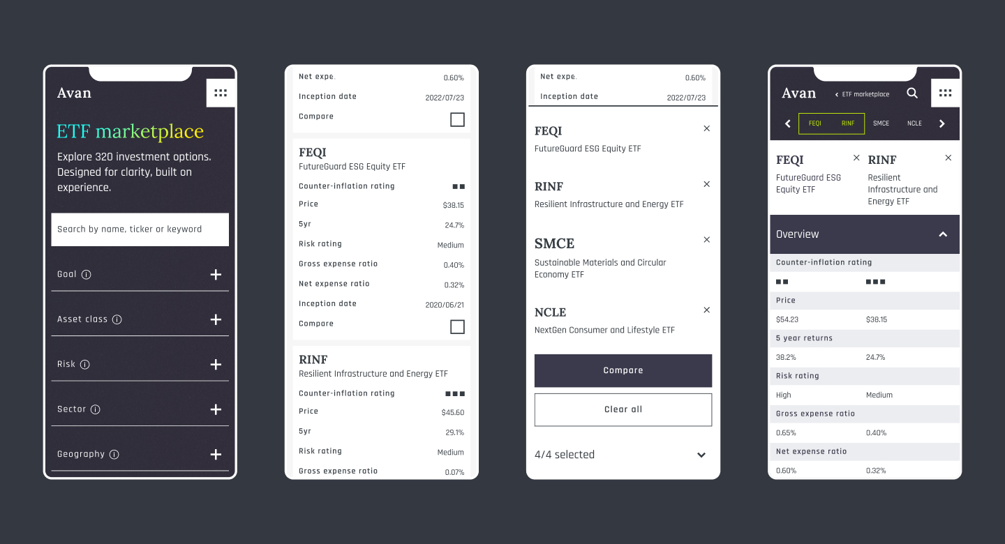
Avan was designed to simplify the ETF browsing experience to help users identify and compare ETFs in a data-dense environment with ease.
My approach
- Conducted a competitive analysis across industry-leading ETF providers to better understand the ETF landscape and identify key gaps and opportunities.
- Distilled findings into key guiding principles: interactivity, clarity, trust, and mobile continuity. Additionally, created high user-impact assumptions to inform both early design decisions and future research.
- Tested early hypotheses around user wants and needs such as: filter complexity, investment goals and data preference, through user interviews and moderated usability tests. These informed key design patterns around data hierarchy and filter interaction.
- Reimagined the ETF searching experience by creating a streamlined, intuitive interface that balances quick scanning with progressive data exploration. Key patterns included improved navigational flow, clearer hierarchy, modular filter behavior, and subtle, responsive microinteractions.
Result
While full functionality of an ETF filter wasn’t in scope, early-stage feedback was strong: users consistently cited clearer layout, easier scanability, and a more enjoyable, interaction. These early indicators validate the foundational UX strategy and demonstrate strong potential for increased user engagement and retention.