Discover
Initial research
To understand the ETF landscape and current tools, I analyzed 8 ETF providers and aggregators with varied data displays and strategies. I grouped my observations by key goals and patterns: first impressions, filter section, product section, and mobile continuity.
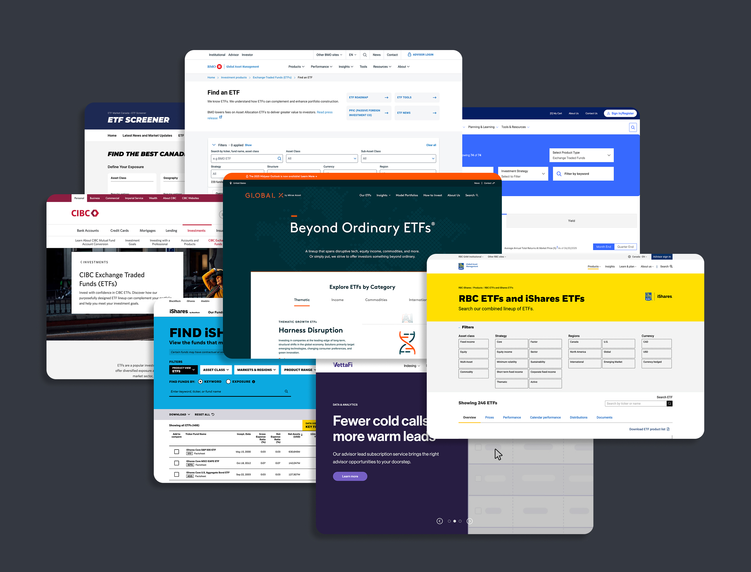
Competitor analysis takeaways
To shape a clear, user-driven strategy, I distilled the competitor analysis into the most influential user insights.
Take-aways
Implication
All competitors do in fact have some type of filtering system
Validates the need for a filtering system
There is often a clear visual separation between filters and product list
Aids scanning and usability by keeping filtering and content browsing mentally distinct
No standardized depth or volume of information
Users face cognitive load when switching platforms
Visual hierarchy is often emphasizes filters and ETF name/ticker, in that order.
Inconsistent data undermines decision-making confidence
Most platforms are not mobile-first
Suggests that users should narrow down search first before scanning, anchored by the ETF name or ticker
Education housed on separate page
Mobile experience is often compromised. May suggest a desktop-first experience in this sector.
No consistent UI or interaction system for filters and pagination
Users face cognitive load when switching platforms
User research
Before conducting user research, I identified two primary user types: self-investors and advisors, which are mainly differentiated by experience. Self-investors are typically beginners, while advisors are experienced professionals. With no direct access to advisors, I created a proto-persona for them and focused research on the self-investor segment.
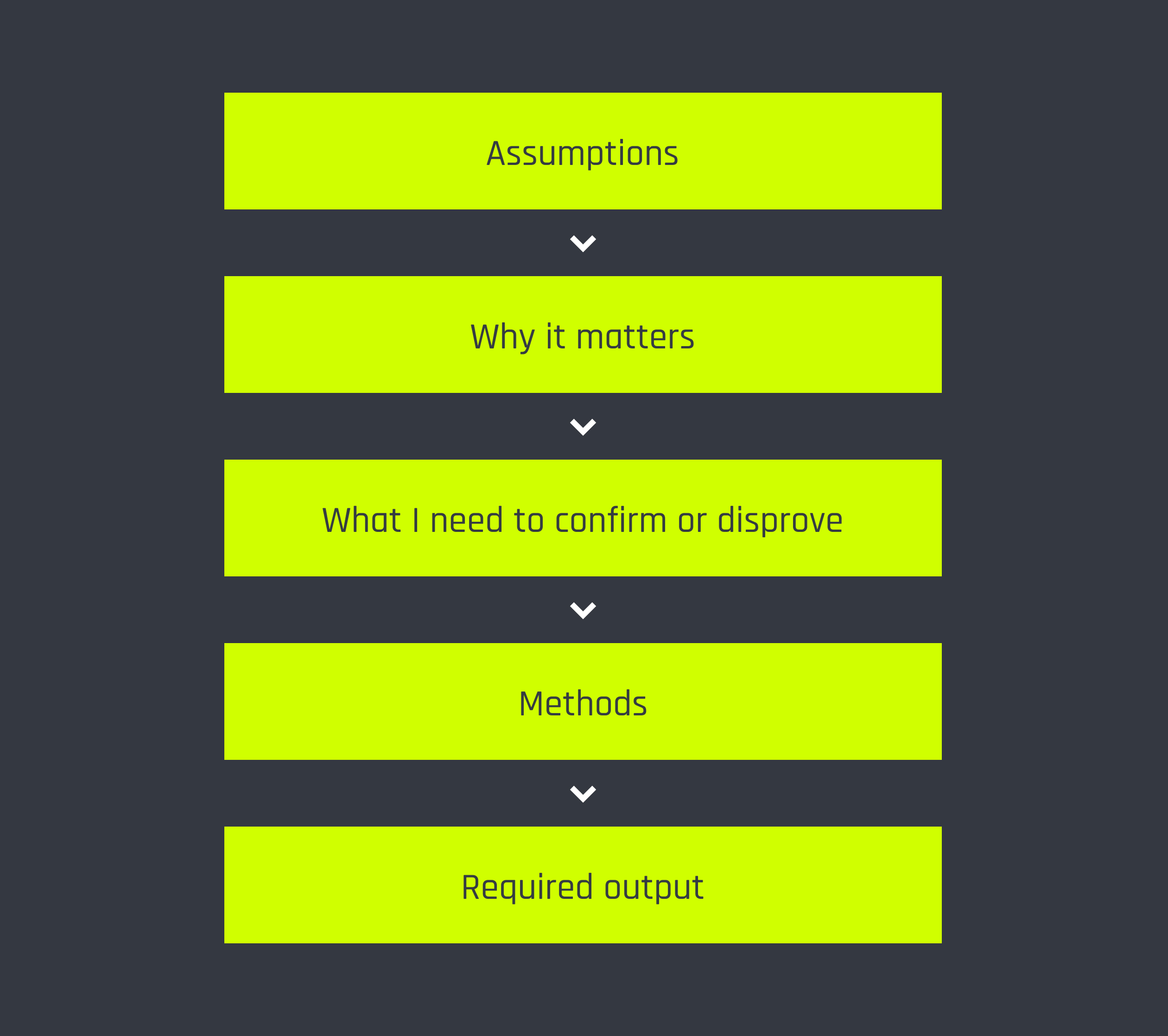
To guide my process, I built a research framework linking assumptions to user impact, research questions, and methods. It included:
- Assumptions from competitive and business analysis
- Hypothesized user impact
- Research methods tied to each assumption
- Desired outputs (e.g., insights, UX themes, design requirements)
Methodology
To validate the assumptions more efficiently, I grouped them by research method, resulting in one qualitative and two quantitative templates for the first phase. This way I could ensure all of my assumptions and key outputs are covered.
Method
Research goals
User interview
Explore the end-to-end user journey of purchasing an ETF
Gain insight into searching criteria, paint points, and expectations(bonus)
Understand motivators behind buying ETF’s in the first place
Gain insight into searching criteria, paint points, and expectations(bonus)
Understand motivators behind buying ETF’s in the first place
Free-form usability test
Understand how users naturally attempt to find and evaluate ETFs without specific guidance
Close-ended usability test
To specifically see how effectively users can use competitor ETF filtering systems

Define
Data results and synthesis
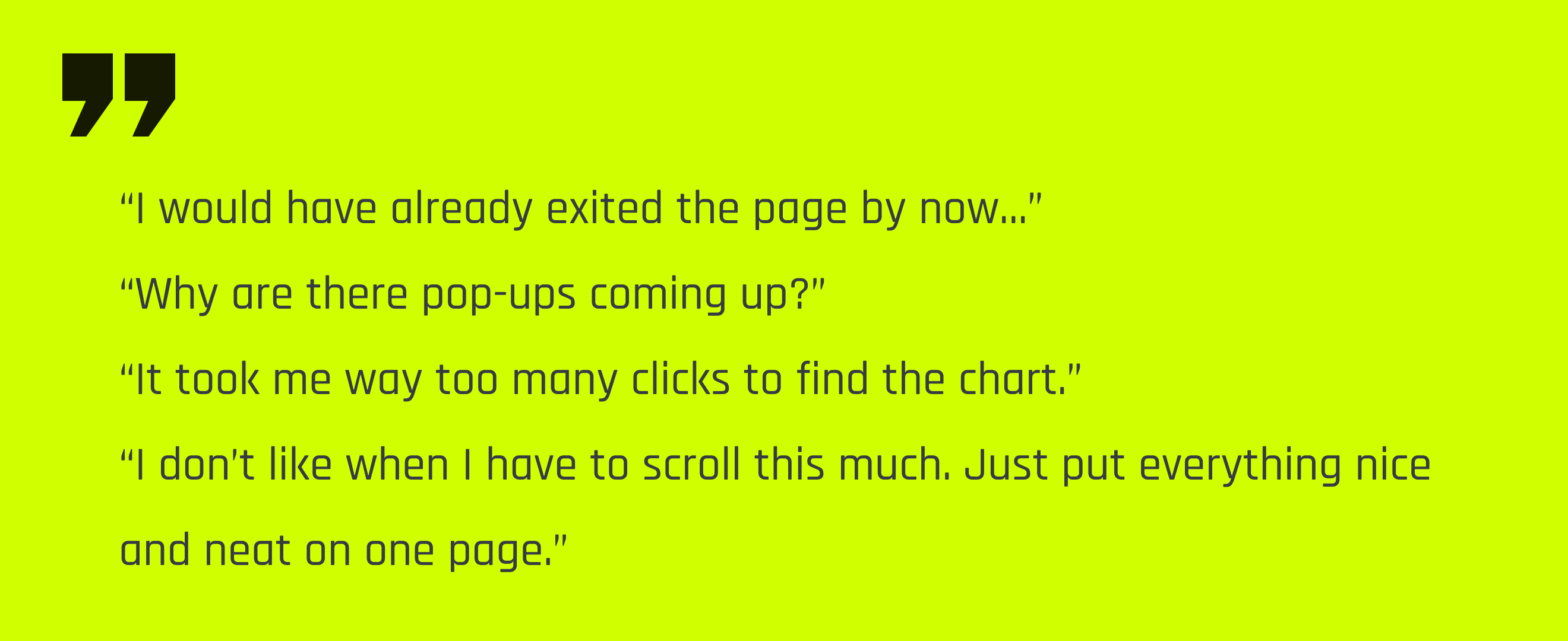
It’s safe to say, there was a lot of frustration going around
To better understand the core challenges users face, I identified the most recurring and high-impact user behaviours. For user pattern, I created actionable design considerations to guide my later design stages.
Patterns
Design Implications
Most people find the product they’re looking for on third-party sites and only visit the provider’s page for deeper info
The site hierarchy should support quick searches and make it easy to find specific ETFs
Each filter comes with a bit of a learning curve, which adds frustration during search
Familiar UI patterns and a clear hierarchy can help reduce friction and make the filters easier to use
The more clicks it takes to find key info, the more frustrating the experience
Important data points and entry paths should be visible right when users land on the site
Desktop is the main screen people use for this kind of research, while mobile is used occasionally as a backup
Mobile should still work well, but the design should prioritize Desktop
Visual cues like color and graphs help users navigate and understand complex info
Use strong visual hierarchy and clear indicators of growth to make data easier to digest
People search primarily by keywords and ticker, and product name
The ticker and ETF product name should be most prominent on a per-ETF-product basis
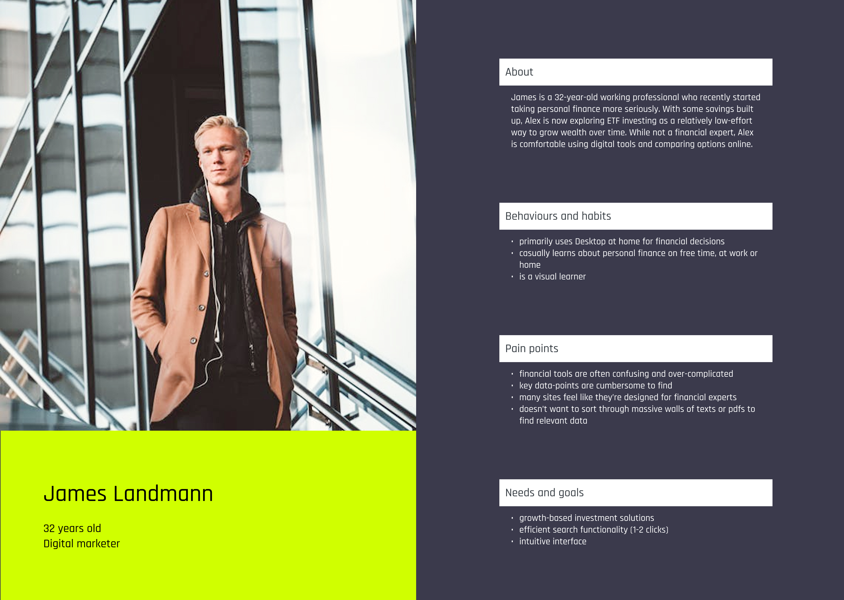
User persona
To better empathize with this user group, I created a user persona based on the main pain points, goals and behvaiours.
Design
To better guide the visual direction moving forward, I took these insights and framed them as “How might we” questions . These include:
- How might we better display visual growth indicators?
- How might we improve hierarchy to facilitate quick search and primary data identification behaviour across the scanner itself and on a per-ETF-product basis?
- How might we might the screener more engaging?
- How might we maintain brand recognition on the ETF screener?
- How might we improve UI for better scanability while maintaining continuity with desktop?
- How might we condense sections into, or close to, a one screen experience?
- How might we serve the needs of both beginner investors and advisors in one seamless experience?
Overall layout
Based on my observations I concluded that most users interact with 3 main areas in most ETF scanners: the filters, the suite of ETF products and the primary data overview per product. This was reflected in my first wire-frame.
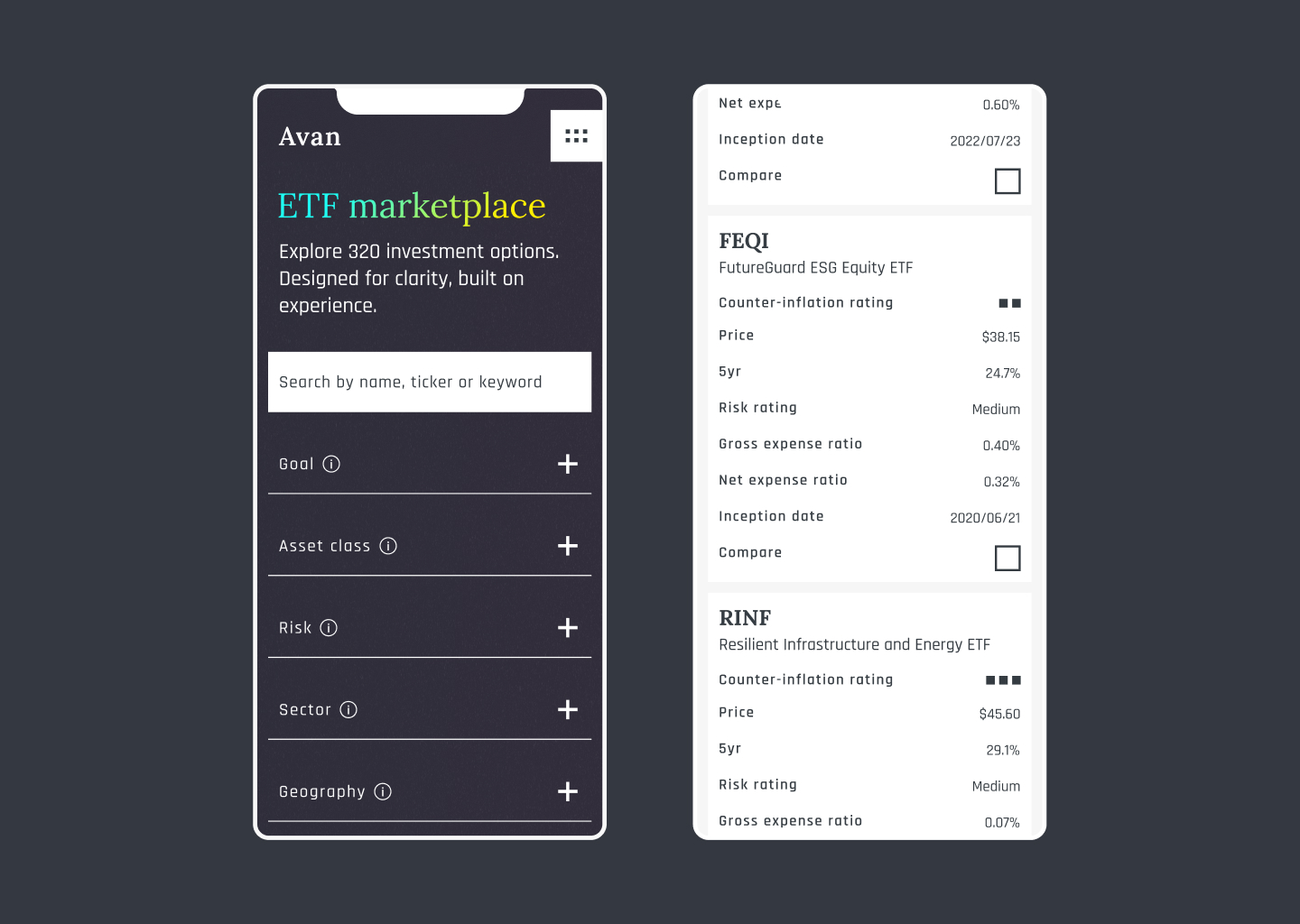
Filter area
Most beginner investors use ETF screeners to look up a specific product, not to explore. While some tried filters, all defaulted to the search bar when available.
As such, I made the search bar the main focus of the filter area. I achieved this by making it the only text input and using the existing high-contrast background to boost visibility.
To support experienced investors and advisors, I included advanced filters below the search bar to avoid cluttering the interface for beginners. To help users track their selections, I added visible tags showing active filters, which can be cleared at any time.
ETF product list
In designing this area, I prioritized quick data access with minimal clicks. However, displaying all data points for each ETF on one page is impractical and better suited for the dedicated product pages. Therefore, some data is shown directly next to each ETF, while additional details are organized into visible subcategories using tabs.
The ticker and name are emphasized and visually separated on the left to improve alignment and readability.
To enhance focus and clarity when browsing, a subtle hover animation was added to ETF products, improving scanability and adding a polished touch.
Additionally, I chose to use pagination as a way to display large amounts of products. This not only allows for more concise continuity on mobile where scrolling might feel endless with too many products, but it keeps the filters and products all together in sight, maintaining a one-screen experience.
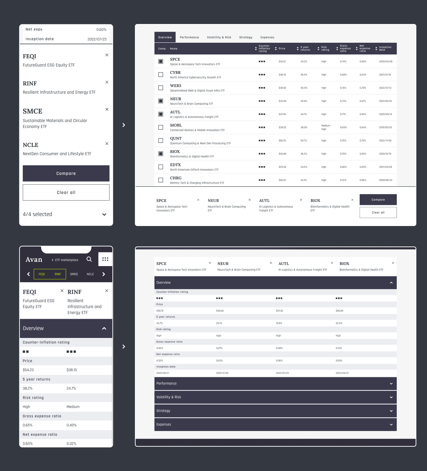
Mobile Continuity
To keep key ETF details easily accessible, I redesigned the ETF list into cards for mobile. While this limits side-by-side comparisons, most users are looking for quick overviews or search for specific ETFs, so this format better highlights each product’s primary information.
Compare tool
While many users didn’t use comparison tools on other scanners, I kept it as a primary visual element to reduce clicks and support advisors, with minimal layout clutter. After multiple iterations, data display was made clear and consistent across desktop and mobile. Due to the complexity of organizing large ETF datasets on mobile, I adopted a mobile-first design.
To improve usability, I designed the pop-up modal in order to:
- Confirm when comparison selection is active
- Display selected items for easy recall
- Eliminate the need for extra buttons or screens when not in use
To further enhance the comparison experience, I:
- Created different layout for the comparison screen (compared to the main screener page) to reduce user confusion
- Replaced the card layout with a vertical, table-like format on mobile to support clearer, side-by-side data comparison
This vertical layout, with distinct headings for each data point, allows quick identification and easier comparison between ETFs.
What I didn’t design and why
To keep key ETF details easily accessible, I redesigned the ETF list into cards for mobile. While this limits side-by-side comparisons, most users are looking for quick overviews or search for specific ETFs, so this format better highlights each product’s primary information.
- Inclusion of specific data categories. This requires deeper UX research and business alignment. My goal was to provide visual separation for different categories of data.
- A tablet version. While this screen will need to be considered, the desktop and mobile explorations will provide all the necessary visual information for a responsive tablet version.
- A usability-test. Due to the screener’s complexity, a prototype wouldn’t sufficiently insightful data compared to current screeners. Instead, a fully coded demo page is needed for meaningful testing.
Deliver
Design Reception
Although this version of the screener was not fully functional, early impressions from informal feedback were positive. Reviewers responded well to the clean, modern interface and the clarity of data presentation in both the filtering tools and ETF list. While it wasn't tested in a traditional usability setting, the design choices were grounded in UX best practices, aiming to support intuitive navigation and legibility. Further validation would come from testing with real user flows.
Future Considerations
While the current design focuses on clarity and usability at a high level, several opportunities remain for deepening the product’s value and tailoring it more closely to real user needs:
- Understanding of professional workflows. Observing how financial advisors interact with ETF screeners would provide valuable insight into their specific goals and pain points. This insight would further improve the tool’s utility for both professionals and casual investors.
- Product pages. The ETF screener often acts as a gateway between external sources and individual ETF product pages. These should be developed in parallel, with their own user research and design considerations, yet ultimately working together to provide a seamless, trustworthy experience
- Stronger brand identity. Since this project prioritized data hierarchy and scannability, branding was intentionally kept minimal. Defining a stronger mission and visual identity could distinguish the product and inspire more engaging design opportunities.