Intro
MS Society of Canada
Type
Responsive web design
Timeline
4 weeks
Role
UX & UI Designer
Team
3
Context
Redesigning a lifeline
The MS Society of Canada is the leading resource and support network for multiple sclerosis patients in the country. Their website is a lot of things at once, from being a donation platform to a research hub, and a community builder. The most important role it plays however is as an emergency resource for people who have just received a devastating diagnosis.
My team of three saw an opportunity to improve the balance between those competing purposes. Within the team I took ownership of the research design end to end, building the survey, crafting the interview questions, and running the interviews directly. On the design side I owned the homepage and donations page, which became the centrepiece of the emotional redesign, and contributed to key UI elements across the remaining pages.
I led the UX research design, crafting the interview questions and surveys, designed the homepage and donations page, and contributed to key UI elements across the project.
Problem
Mixed priorities
The first impression of the original site was quite frankly, shocking. An alarming red colour palette, a ticking donation clock, time-sensitive language, competing calls to action, all seemingly pointed at one thing: donations.
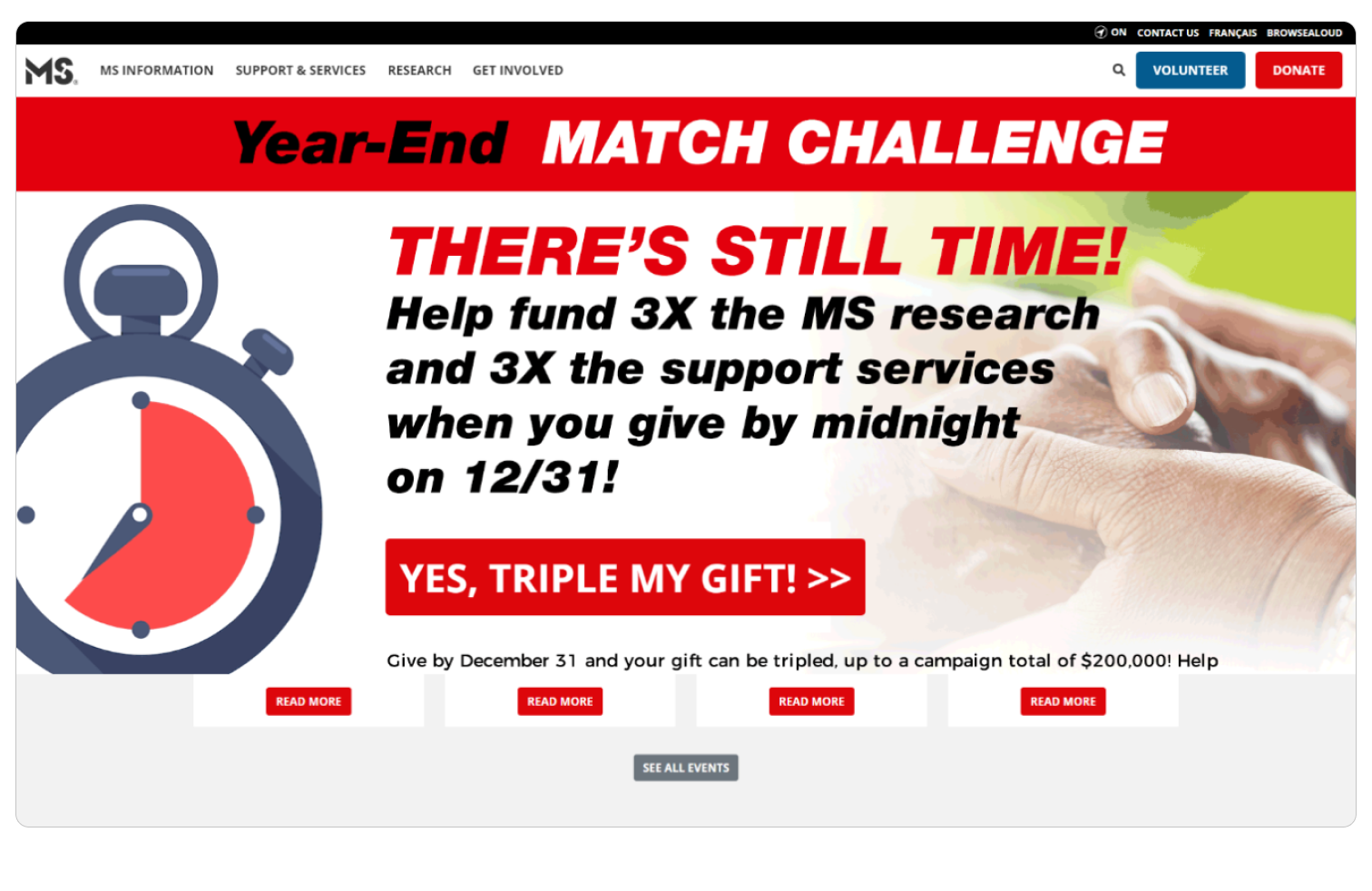
While the business logic seemed reasonable, it came at a cost. The experience felt anxiety-inducing to first-time visitors at what is likely a very frightening time of their lives.
This design led us to more questions than even assumptions:
- Who is our user?
- What is the goal of the website?
- What is the non-profit landscape like?
- What is the accessibility like?
Research
What the site was hiding
Who is the user?
I designed a survey and interviews to understand general donation habits from frequency of donations, to amounts, motivations, and trust levels around non-profits. The goal with the survey was to establish broad patterns first, so I kept most questions multiple choice before going deeper in the interviews.
Three findings across 25 surveys stood out:
Key user survey takeaways
87%
of people are more likely to donate to a cause that personally affected them or their family
88%
prefer one-time donations
62%
never engaged in non-profit events
The interviews went deeper. I knew from personal experience that donating often comes with conflicting feelings. Guilt, doubt, and uncertainty about impact. I wanted to create enough space for people to be honest about that without feeling judged. What came back was consistent: people need transparency and proof of impact before they trust an organization with their money. Urgency certainly does not build that trust.
Key user interview takeaways
- Difficulty in budgeting for donations
- Lack of trustworthiness amongst non-profit organizations
- People are most likely to donate/participate in causes they relate to
“I am more motiavetd to donate if I can see or hear success stories of how this specific organization helped people so I know the money is actually making a positive impact”
Contextual research by the team
To support those findings with a broader picture, the team conducted a heuristic evaluation of the site with each member adopting a distinct role: donor, newly diagnosed patient, and long-term patient. These roles were inferred from the type and volume of content on the site rather than confirmed user data, making the findings directional rather than definitive. Card sorting surfaced four categories worth investigating further: target audience, accessibility, navigation, and organizational goals.
A SWOT analysis of comparable non-profits ran in parallel, revealing that the strongest ones shared four qualities: emotionally impactful imagery, consistent design, a clear articulation of mission and scope, and a layout that guided users sequentially rather than presenting everything at equal weight.
Usability testing on the existing site focused on three core tasks: donation, support access, and resource access, tracked by time to completion and success rate. The site had an abundance of resources, but they were inconsistently presented, sometimes buried in downloadable PDFs, and organized in ways that made navigation genuinely difficult.
The stakeholder meeting that changed the brief
Everything above pointed in one direction, but then the brief changed.
We were able to connect with an MS Society representative who shared two years of their own marketing and UX research. What we found out was surprising:
- The majority of users were visiting to gather resources for recently diagnosed patients, not to donate
- Most found the navigation confusing and cumbersome
- Most felt a lack of emotional connection to the content
The site had been built around the organisation's funding needs, but its users needed something else entirely. Now we had the data to prove it.
Refined Problem
How can we better facilitate newly diagnosed patients of Multiple Sclerosis find the resources they need?
The real problem, according to the stakeholder and their research was that visitors were leaving the site without the resources they came for. And the people most affected by that failure were newly diagnosed patients.
As a team we surfaced a new hypothesis: simplifying the navigation and creating a genuine emotional connection for newly diagnosed visitors would allow them to find what they needed within a single visit. Because donations are still ultimately important to the foundation, that journey was still prioritized but not at the expense of the people they’re trying to serve.
Execution
Designing the homepage like a first conversation after a diagnosis
Emotional architecture
To anchor the empathetic journey, I approached the homepage layout the way a good doctor might approach a first conversation with a newly diagnosed patient: by acknowledging the gravity of the moment, providing clear next steps, and close with hope for the long-term. This established future design decisions from colour to verbiage to imagery.
Verbiage
I rewrote the copy to feel personal and supportive rather than transactional. The words needed to feel like a guide moving alongside the user.
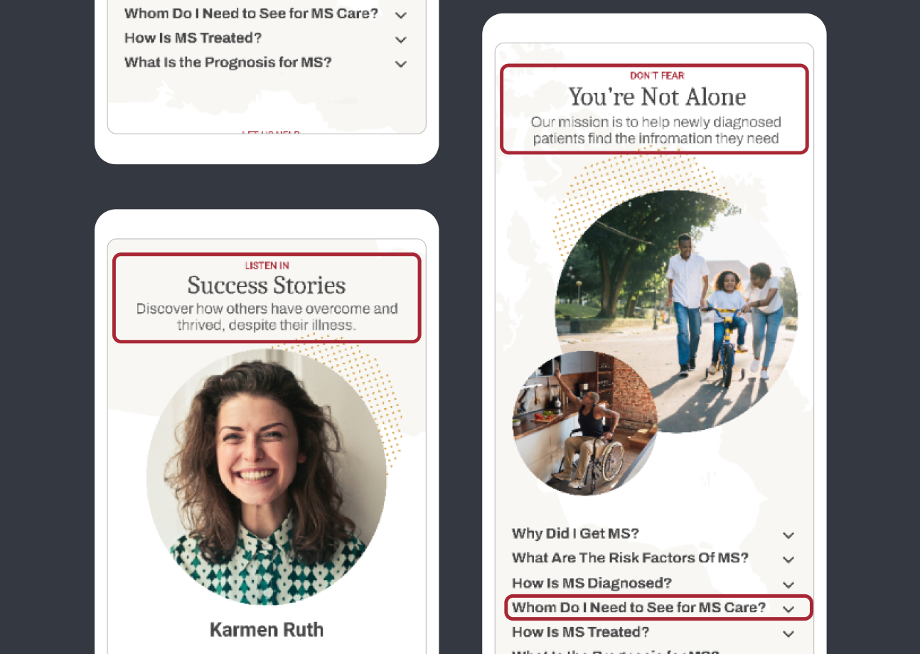
Imagery and community
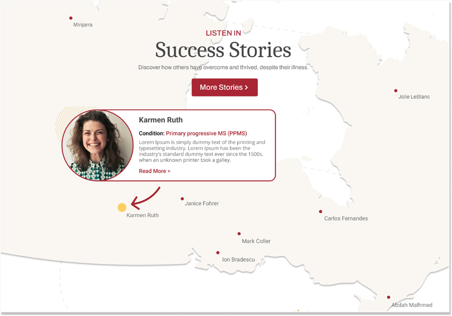
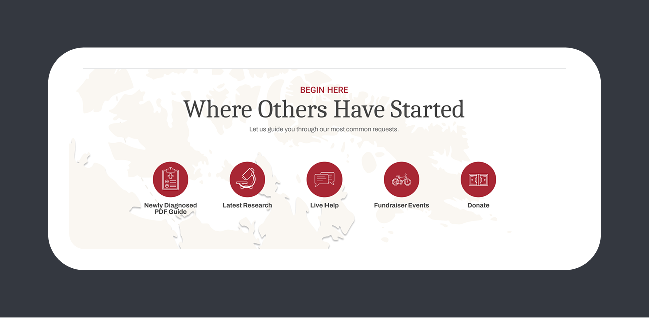
One of my boldest ideas was using the map of Canada as an interactive way to discover and learn more about other MS patients living across the country. The intent was to create a visual sense of community and provide genuine hope that you are not alone, and there are many others living full lives with this disease.
Navigation
Drawing on the most popular search items provided by the stakeholder, I redesigned the navigation menu to surface the most commonly needed destinations immediately for first-time visitors arriving in crisis and returning users who already knew what they were looking for.
Colour
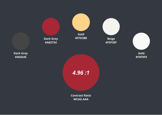
As re-branding wasn’t part of the scope, I kept the red as the primary color. I also chose a calmer, more neutral supporting palette reducing the visual aggression of the original and making the experience feel less urgent and more like a place of support.
Outcomes
Emotionally and functionally better
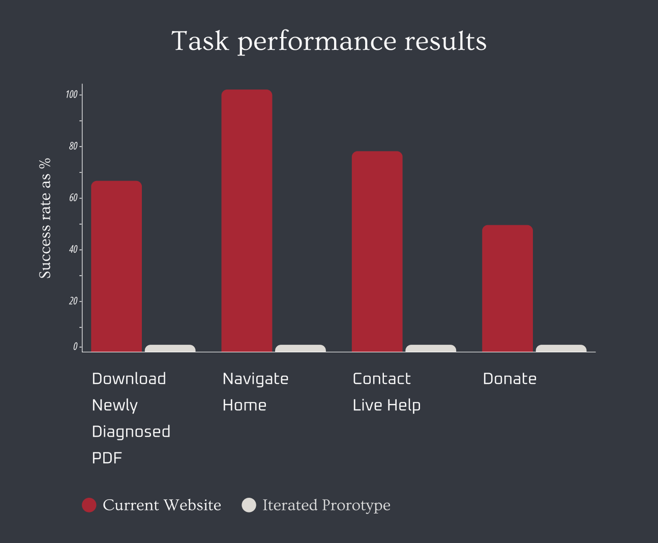
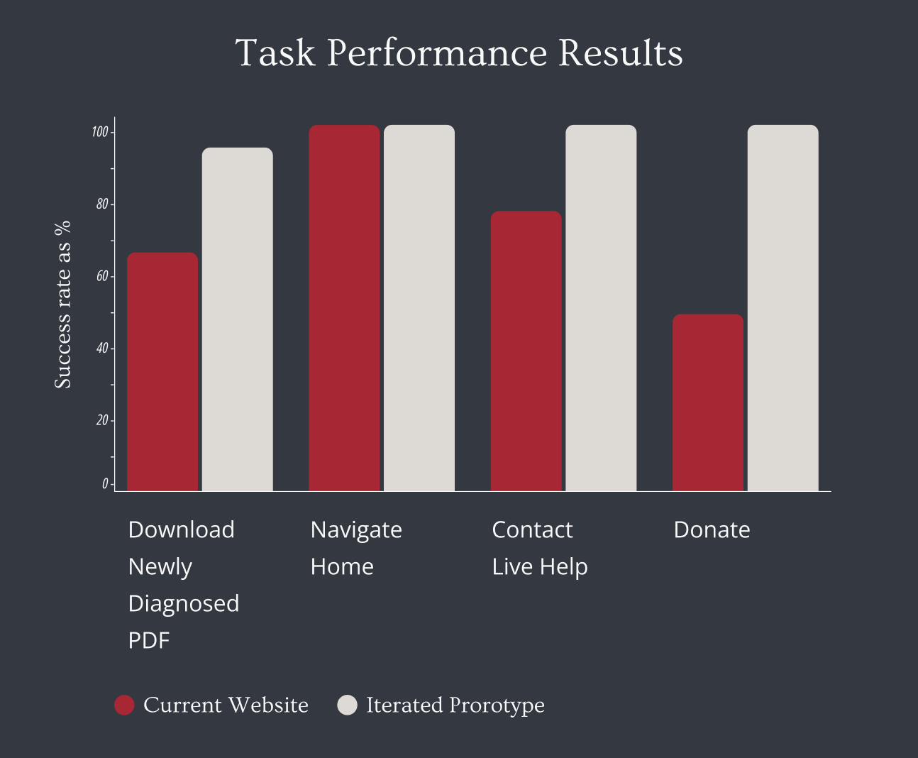
We ran the same 4 tasks on the redesign where users navigated freely and the success rate climbed from 74% to 98%.
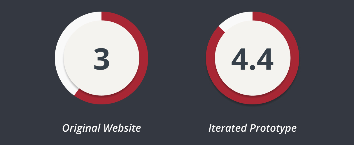
To measure the emotional connection separately, we asked users a qualitative question at the end of each task set. Comfort level climbed by 24%.
On a scale of 1-5 how emotionally comforted or supported do you feel while navigating the website?
Learnings
What the brief didn't tell us and what we'd do next
The stakeholder data was the pivot point of the project, but it also exposed how much we still didn't know. A follow-up conversation revealed that local events and community building are a significant organizational priority. This was something that barely appeared in the original design and wasn't fully addressed in ours either. Understanding how the MS Society builds and sustains its community would be a key focus in the next phase.
Donations also deserve a more nuanced approach than either version has given them. The research showed that people donate most readily to causes that have personally touched them , which means the path to more donations likely runs through better emotional storytelling and clearer proof of impact, not harder fundraising pressure. That's a design problem worth pursuing all on its own.