Context
Trust is hard to earn and easy to break
I've used several money transfer apps and some of them just felt… off. Not quite an obvious scam alarm, but a subtle friction I couldn't quite place. Whether that signal came from ill-intent or simply a lack of refinement, the result was the same: my trust dropped completely. That ambiguity made me curious about what specifically causes that feeling, even when an app appears to function perfectly well on the surface.
Movo is a conceptual mobile money transfer app. The design challenge centred on trust in a single moment: onboarding. In fintech, this is where users decide whether they trust a product enough to hand over personal information and legal agreements before they've received anything in return.
Why onboarding specifically? Trust in a product is built from many things: visual fidelity, consistency, and function. Onboarding is self-contained enough to stress-test those signals in isolation, without needing to design an entire app that might still not capture the full picture. It's a small, high-pressure environment where trust either forms or it doesn't.
Problem
How do you collect sensitive financial data from a stranger without making them feel like a suspect?
Fintech onboarding sits at a fundamental tension: collect too little data, and the product feels unserious. Collect too much, or collect it poorly, and users feel surveilled. Without a consistent industry baseline, users arrive at every new app with elevated caution and little learned expectation to fall back on.
The design challenge was as much about data collection as it was about how the experience felt. Did users leave each screen feeling more confident in the product, or less?
Insight
Every friction point is a drop in trust
To establish a baseline, I analyzed five leading money transfer apps: Revolut, Remitly, Western Union, Ria, and WorldRemit, specifically to assess the relationship between emotional state and perceived security at each step of the onboarding journey.
Four recurring tensions surfaced from the audit:
Take-aways
Implication
No standard for type, amount or order of data collection.
Users experience increased caution due to the lack of a familiar baseline.
Strong hierarchy and consistent design leads to a predictable and easy to digest experience
Clear main actions and notifications signal that the company understands user needs well, increasing user confidence.
Variability in branding consistency and tone (including interactions and animations)
Inconsistencies with brand tone reduce perceived thoroughness, decreasing trust in app security.
Security features work best when justified and framed as safety measures rather than surveillance
Transparency makes the experience feel more like a collaboration, thus increasing trust and confidence in the user.
One of the most surprising findings was this: lots of screens combined with little reassurance along the way created feelings of tediousness and surveillance. I found that apps that collected more data didn’t necessarily lose trust, but apps that collected data without explanation consistently reduced it.
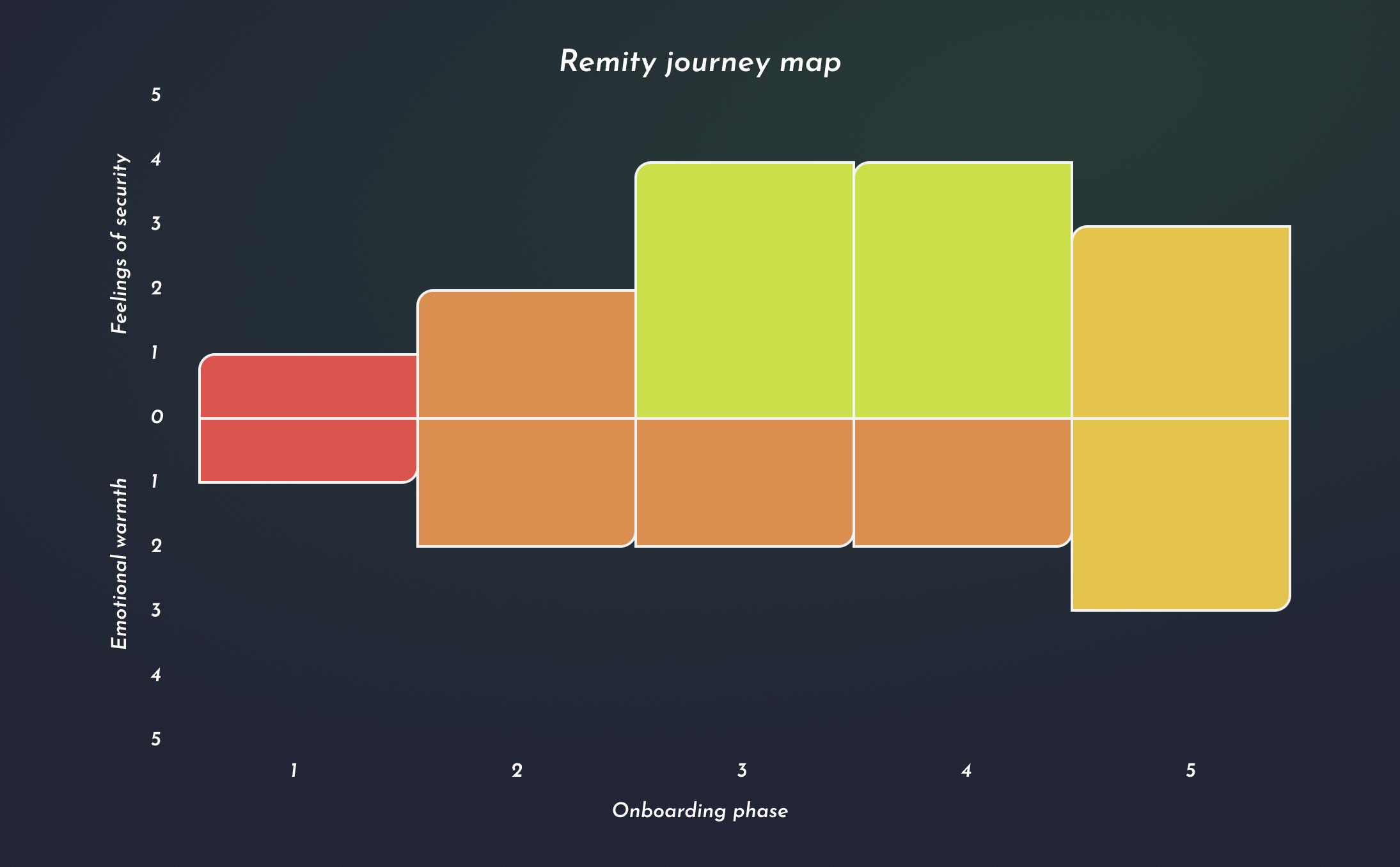
A secondary finding of note was that flows with fewer than three screens felt unserious, while anything beyond seven felt tedious. This gave me a target range, which, along with the most common data collection points found across competitors, gave me a clear framework to work within.
Execution
From principles to pixels and motion
Guiding principles
Before any design decisions, I defined 4 guiding principles derived directly from competitors' strengths and pain points. These were:
- Transparency: Are all the data collection requirements clearly explained?
- Predictability: Can the user anticipate follow up interactions and screens? Does the app respond intuitively based on user input?
- Consistency: Does the app approach similar tasks or data displays in the same way?
- Empathy: Is reassurance and warmth provided where applicable, particularly during personal data input and legal agreements?
Each principle carried implications across three main aspects: visual, interaction, and content. This was the lens through which future decisions were evaluated.
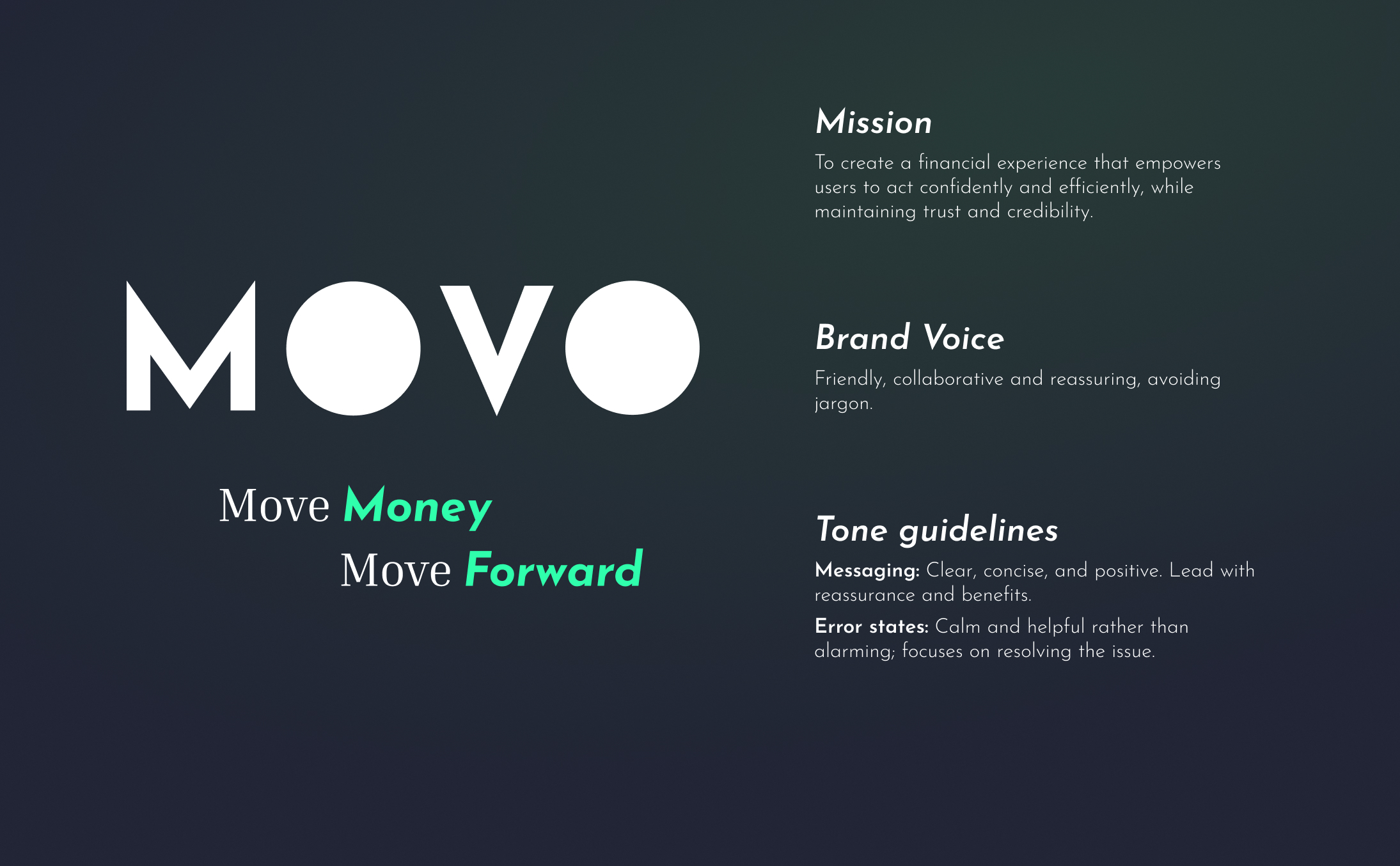
Brand identity
I chose a single adjective as the brand foundation: momentum. Why momentum? The goal was a word strong enough to act as guardrails keeping the design intentional and consistent throughout, with the secondary effect of confidence and forward momentum for the user.
From there, the name Movo emerged, a play on the word “movement”, with the slogan "Move money, move forward."
Structure and content mapping
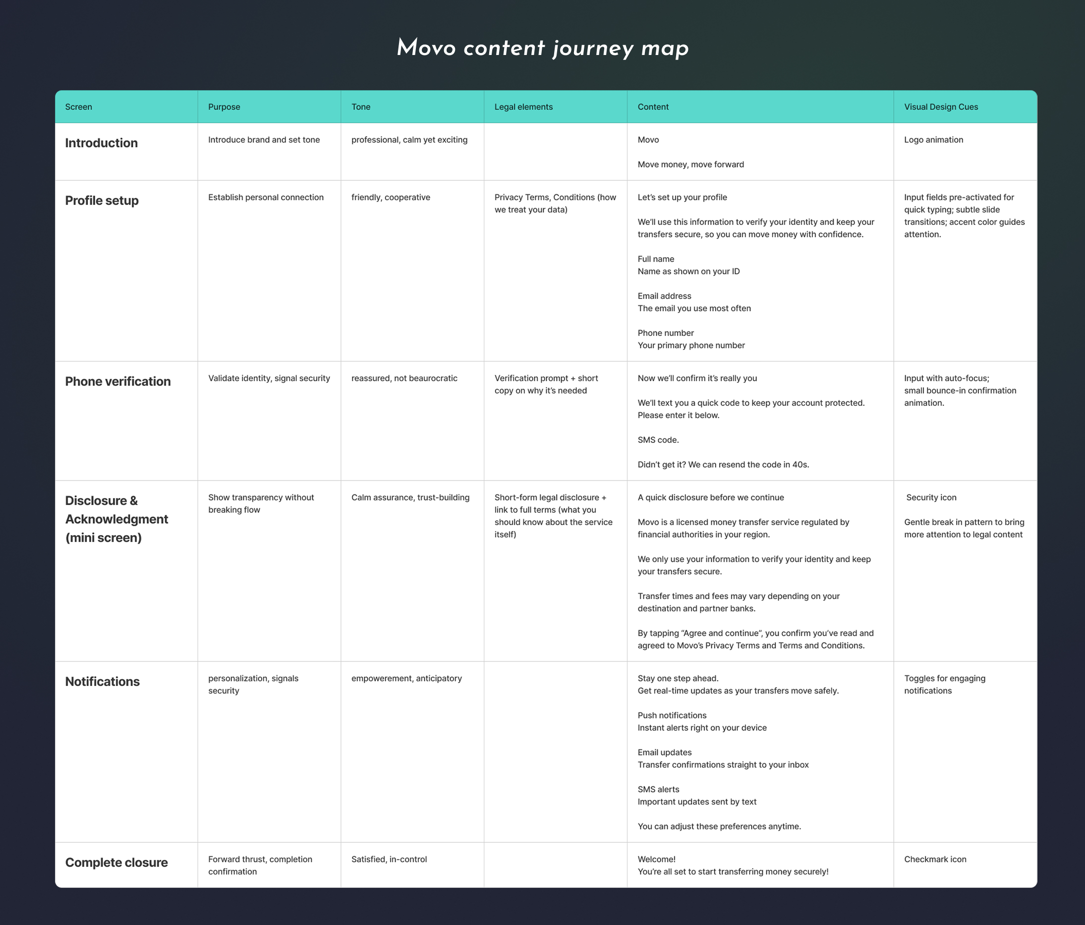
Since there's no industry standard onboarding flow, I grounded the structure in the only constants across all five competitors: name, phone number, email, terms, and privacy agreements.
I then built a content journey map using the above content, tracking both cognitive load and emotional reassurance screen by screen to identify where users might feel overwhelmed, where the guiding principles weren't being upheld, and where the brand was being underused. This process led me to a total of six screens: enough to feel thorough without overstaying its welcome.
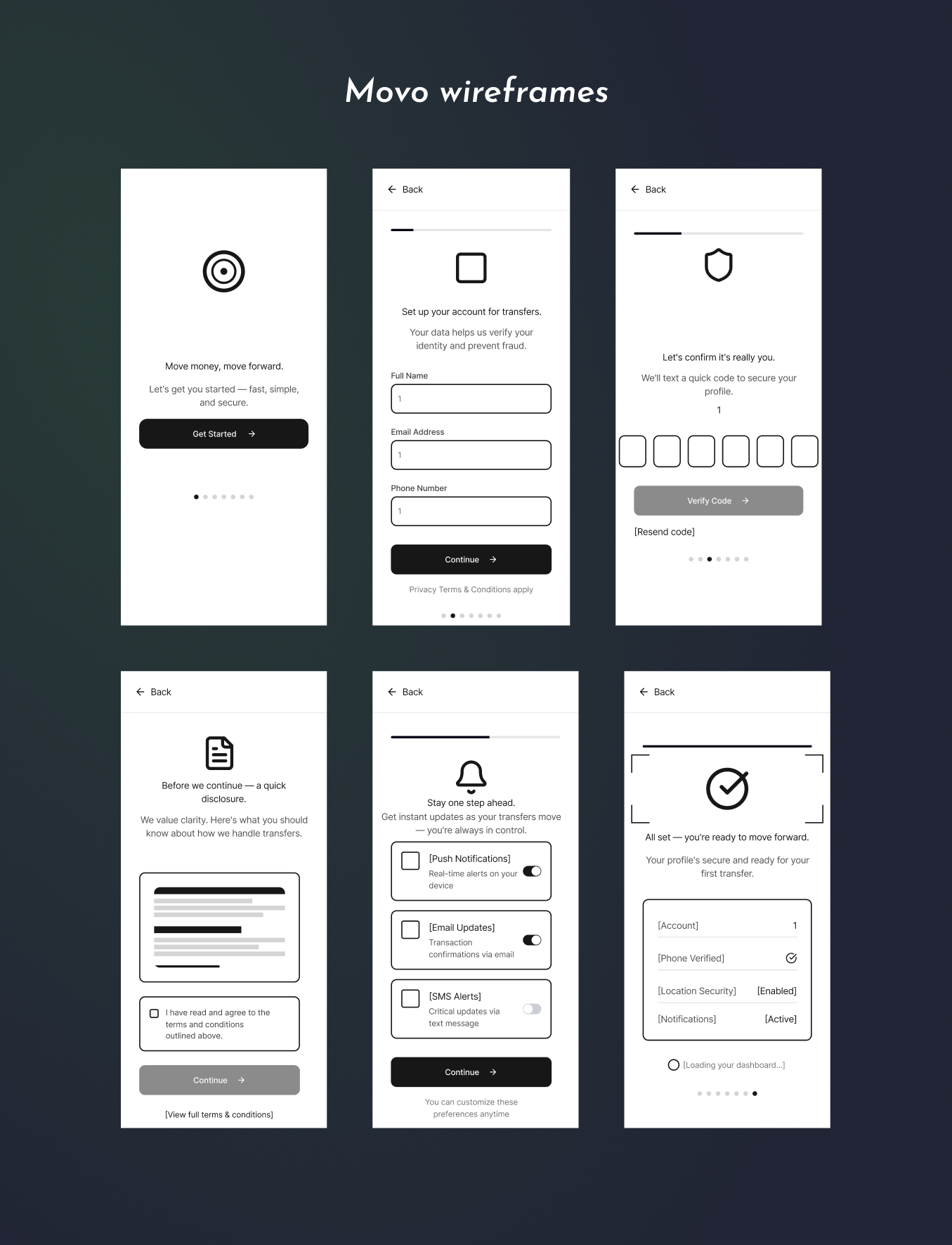
Wireframing with AI
With direction established for brand, content, and structure, I used AI to generate multiple wireframe layouts quickly. I wrote a detailed prompt that specified the content required elements and invovled interactions, screen-by-screen. Each output was then evaluated against three criteria: alignment with guiding principles, brand coherence, and the balance between reassurance and security. This gave me more time to assess that balance in detail and iterate further, rather than generating options from scratch.
Visual Language
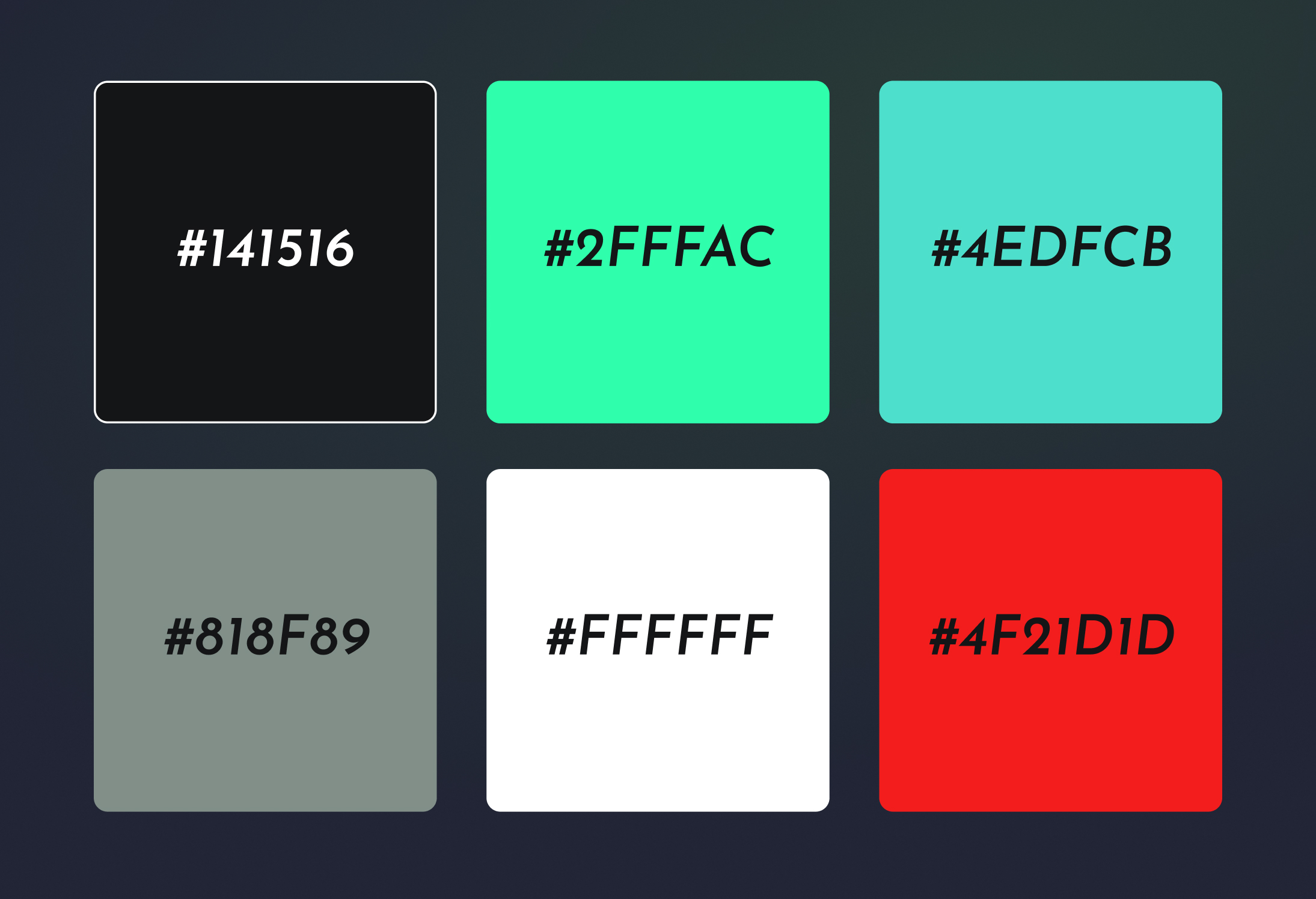
I chose a palette of dark navy, turquoise, and white, colors that feel familiar and trustworthy in the fintech industry without competing with the bright greens and blues that saturate competitors. Every element was checked against the brand guidelines and guiding principles during iteration.
Motion design
The motion throughout the journey (intro screen, progress bars, confirmation states, transitions) was designed to create a consistent sense of forward movement toward the registration endpoint, further reinforcing the brand's core metaphor through interaction. The intro screen features subtle coin animations rotating and transitioning from one currency to another, communicating the app's purpose before a word is read.
Prototyping
Using a combination of Rive, GitHub, and Figma Make, I built a fully functional prototype with working inputs, error states, and the logo animation included. It took close to 100 iterations to get the experience right. The most challenging aspects were refining how and when user feedback appeared, creating a seamless flow between inputs, and ensuring the visual hierarchy guided the eye naturally through each screen.
Outcomes
Validated by exploratory user sessions
I conducted 6 exploratory user sessions, giving participants a single task: sign up. Afterwards I asked whether they would feel confident using the service. Feedback consistently described the flow as sleek, professional, thorough, and credible. No friction points were flagged. Users navigated all six screens without prompting (except for entering arbitrary security codes) and completed the flow in under 2 minutes, with no questions about why specific data was being requested.
Learnings
What I learned and what's next?
Designing for trust is a culmination of subtle elements and signals working together to remove as much friction as possible, whether it’s functional or perceived. High function without visual polish signals an unprofessional product. High fidelity without function signals a scam. Designing for trust means getting both right simultaneously. Onboarding is where that tension is most exposed.
One assumption made early that would require further validation is that people would want to sign up to Movo without any prior value offer or knowledge, which begs the question: How would known value offerings alter the trust level during the onboarding experience? Given more time, research into user motivations could improve the app by stress-testing it against different user biases, expectations and goals.