Type
Financial Web App Design
Financial Web App Design
Timeline
12 weeks
12 weeks
Role
UX & UI Designer
UX & UI Designer
Team
3
3

Overview
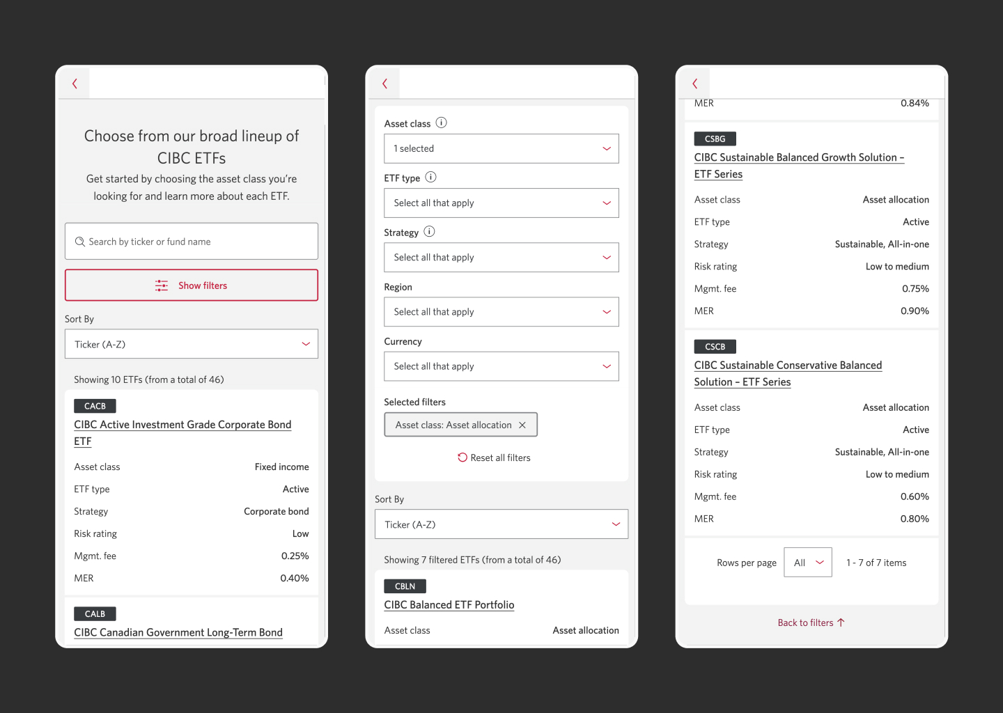
The new ETF filter was designed to simplify the product browsing experience, helping users identify and compare ETFs in a data-dense environment with ease.

My approach
- Conducted a competitive analysis across industry-leading ETF providers to better understand the ETF landscape and identify key gaps and opportunities.
- Distilled findings into key guiding principles: interactivity, clarity, trust, and mobile continuity. Additionally, created high user-impact assumptions to inform both early design decisions and future research.
- Tested early hypotheses around user wants and needs such as: filter complexity, investment goals and data preference, through user interviews and moderated usability tests. These informed key design patterns around data hierarchy and filter interaction.
- Reimagined the ETF searching experience by creating a streamlined, intuitive interface that balances quick scanning with progressive data exploration. Key patterns included improved navigational flow, clearer hierarchy, modular filter behavior, and subtle, responsive microinteractions.
Result
Reception was positive, with users specifically noting the clear, on-brand redesign and ease of use. Upon re-testing, the usability test had a success rate of 100% compared to only 20% previously, greatly improving the find-ability of products in the table.