MS SOCIETY

The leading resource and support for multiple sclerosis patients in Canada

WHAT

Responsive Web Design

TIME

4 Weeks

TYPE

Redesign
“I feel stressed just looking at it”
Team Member when visiting the site for the first time.
OVERVIEW
The Multiple Sclerosis of Canada website was designed to provide a support system for those struggling from MS or friends/family members of those.
PROBLEM
Visitors struggle to find the information they need which is causing them to leave the website without the resources they require.
HYPOTHESIS
My team and I believe that simplifying the navigation structure and creating an emotional connection for newly diagnosed parties will allow them to gather the information they require within their first visit

MY ROLE

Within my team I:

  1. designed the UX research template
  2. designed the homepage and donations page
  3. contributed to the design of key UI elements.
  4. crafted the interview questions and surveys
WHY MS SOCIETY?
From gathering donations, funding related research to presenting a library of resources to patients and growing a strong community, the MS Society deals with a lot of aspects of the cause.  

My team and I saw an opportunity to improve the balance of these elements to better traverse the sea of information, while increasing engagement with the community and providing more emotional support to those diagnosed.

So we had a more detailed look at the website...
Process

FIRST
IMPRESSIONS

  1. Alarming colors and imagery
  2. The Donate and Volunteer buttons are fighting for attention
  3. Redunant links
  4. Inconsistent design elements
Assumptions
1. Donations are the main goal of the website
2. The people visiting the site are either diagnosed with MS or family and friends of those diagnosed
3. People don’t fully trust that charities utilize their money appropriately
4. People visit the website after receiving diagnosis to gather more information and resources

The red color theme, ticking clock and time-sensitive verbiage all point to the heavy importance of donations for MS Society. My team and I agreed however that this comes at the cost of an anxiety-inducing experience when first browsing the website.
A working Problem Statement
How can we improve the initial site experience to increase donations for MS Society?
KEY UNKNOWNS
To better asses the situation I knew I had to understand the MS Society from multiple angles. I subcategorized the broad and specific questions I brainstormed into four main categories of interest:
1. Who is our user?
2. What is the goal of the website?
3. What is the non-profit landscape like?
4. What is the accessibility like?

01

OUR USER

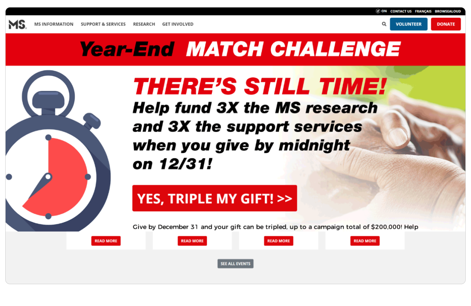
The emphasis on donations on the hero page led me to assume a large part of their users, or their target market is composed of people wanting to donate to the cause.

As such, I first wanted to get a deeper understanding of the reasons people donate to a cause. We will later find out this assumption turned out to be WRONG. Nonetheless our findings helped inform our final design.

Survey
My goal here was to understand how often people donate, what tools they use, the range of donation amounts, and general impressions about non-profit organizations. Since I knew I couldn’t dig deeper into the answers given, I designed most questions using the multiple-choice format in order to paint a clear and insightful picture of people’s general donating habits.
87%
of people are more likely to donate to a cause that personally affected them or their family
88%
Prefer one-time donations
62%
Never engaged in non-profit events
user interview
There are many factors that influence one’s donation-making decisions. I know from personal experience that the thought process often comes with some sense of guilt and conflicting reasons for why I may or may not donate. My goal with the interview was to traverse this potentially sensitive area for people with ease in order to gain honest insight behind their donating habits.
What motivates you to begin donating? Why?
“I am more motivated to donate if I can see or hear success stories of how this specific organization helped people so I know the money is actually making a positive impact”
Do you engage in one-time donations or recurring donations?
“Generally I do one time donations. I would do it more often depending on the price”
Have you used your hobbies to engage in social events for positive change?
“...  it felt good to get the feedback saying, like, you really helped me and like, I feel better now. So that kept making me want to go back to do that.”
What is your thought process behind evaluating whether a website is trustworthy or not?
“If there are spelling mistakes ...too colorful or vibrant, especially for a non-profit. I would also want to see an official logo with a government flag if applicable.
Key Takeaways
  1. Difficulty in budgeting for donations
  2. Lack of trustworthiness amongst non-profit organizations
  3. People are most likely to donate/participate in causes they relate to

02

Non-Profits

How are other organizations tackling their respective missions? We chose to do a SWOT analysis to get a broad understanding of similar organizations. This is what we found...

Strengths
The organizations we looked surprisingly had little in common outside of being able to donate various amounts regularly or one time. They varied in depth of content, missions, and design quality.

By focusing on the cumulative strengths of our competitors we were able to define a few key important areas for improvement for MS Society:
  1. Emotionally impactful imagery
  2. Consistent design elements
  3. Thorough description of the organization’s mission and scope
  4. Journey-based layout where one piece of information lead seamlessly into the next

03

ACCESsIBILITY

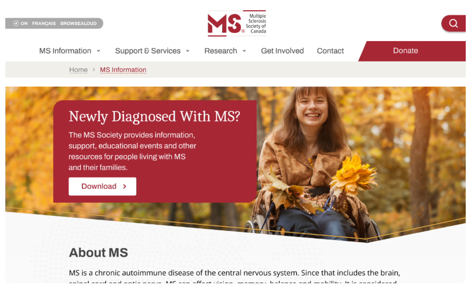
Throughout our research, my team and I noticed the abundance of resources and infromation provided.

We found a lot of variations in layout and general presentation of information, sometimes providing downloadable pdfs, which made navigating the website unintuitive at times.

What are they looking for?
While designing the usability tests to reflect this navigational issue, we also wanted to gear the tasks towards what we believed are areas of focus for the website: donation, access to support, and access to resources.

04

WEBSITE GOAL

Although many of the layout decisions on the original website pointed at the importance of donations, our shareholder meeting revealed other intentions from their users.

Shareholder meeting
We were lucky enough to get in contact with an MS representative who graciously shared with us 2 years worth of marketing and ux research of their own. In terms of prevalence the following was found amongst their users:
There to gather resources for recently diagnosed patients... not to donate
Found navigating the website confusing and cumbersome
Found a lack of emotional connection to the content
COMPILING OUR INSIGHTS
Compiling our findings revealed 3 main concerns for users:
  1. Access to MS information
  2. Difficult to navigate
  3. Lacks emotional connection
Thus we used these points to formulate the following....
The final problem statement
Visitors struggle to find the information they need which is causing them to leave the site without the resources they require.
Hypothesis
Simplifying the navigational structure and creating an emotional connection for newly diagnosed patients will allow them to gather the information and resources they require within their first visit.
What about donations?
Although the research received from our stakeholder didn’t indicate donations as a priority for its user, she did mention it is one of the main ways their organization is funded, and the current design also points to its importance.
Empathy at its core
I tackled the homepage layout design in a way that inherently solved the lack of emotional connection, while making the navigation intuitive and accessible. Much like a doctor might walk someone through first steps then a long-term outlook upon a new diagnosis, I wanted the homepage to have a similar sense of guidance and ultimately, comfort.
Calmer colors
Since the MS Society logo is red, we decided to keep it as a main color, but toned down from the original. I chose a more neutral color palette to compliment the new red so it is less striking to the eyes and thus makes users feel more at peace. Given the dehabilitating nature of the disease, accesibility is paramount.
Comforting Verbiage
I furthered the emotional connection with users by chosing words and phrases that were not only informative but felt more personal and supportive, perhaps even like a guide throughout the website.
Impactful Imagery
Lastly, to emphasize the content and create more of a flow and narrative on the website, I utilized the map of Canada to provide a decorative backdrop, connecting each of the sections together, but also to be used as an interactive element to discover various MS Patients in Canada. I did this with the intent of visually creating a sense of community and providing hope that there are many others out there with the disease that are living fruitful lives.
More ways to navigate
Bringing together all of the above elements, I also wanted the homepage to cater to new and old users using the most popular search items as provided from our shareholder to create a more streamlined navigational experience.
Quantitative
Users performed the same 4 tasks on the original and 1st iteration of the website. We were very pleased with the steady improvements in navigation at each stage. The overall success rate climbed from 74% to 98%.
Qualitative
To test the emotional connection portion of our design we asked users the following question at the end of the set of tasks. The overall comfort level climbed by a factor of 24%.
SINCE THEN
Although we acquired a lot of information about users’ search interactions with the website from our shareholders, we still made a lot of assumptions about the underlying goals of the website.

A follow-up chat revealed that local events and community-building are in fact a big focus of theirs. They also admitted that while donations are not at the top of their priority list, it is one of the main ways they fund their organization.

Understanding how they go about building their community would help propose further solutions to further MS Society’s mission.

Final prototype

Follow the link below for Figma Prototype

Prototype